Appealing entryways and perfectly composed living rooms… Why is it that certain spaces have that magazine look? And how can you achieve that at home? The simple answer: furniture vignettes. Furniture vignettes are popular for photo styling, events, and even weddings. You can also use them throughout your home to add a pop of style.
Read on to learn more about what a vignette is and how you can create them.
What are Vignettes in Design?
The term “vignette” carries many meanings. But within the design world, this borrowed French word connotates the idea of framing. Vignettes are curated style statements composed of localized groupings of furniture or decor — they’re an interior design trick responsible for creating that magazine-worthy curated effect.
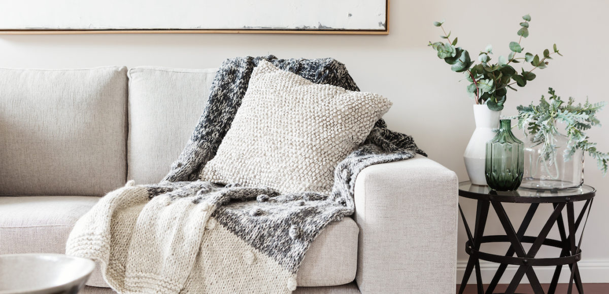
A decor vignette refers to an artfully composed assortment of objects atop a table or bookshelf — think faux plants, small decor pieces, candles, or even books. On a larger scale, furniture vignettes describe carefully selected and placed groupings of furniture and larger decor items. Furniture vignettes are composed of tight but well-balanced groupings of lounge seating, tabling, accent furniture, and decor elements — like rugs or lamps.
5 Tips for Creating a Furniture Vignette
Think on the Small Scale
End up with an awkward corner in your living room? Always think about your open-concept kitchen and dining room as one and the same? A furniture vignette (or perhaps a few) is in order.
Instead of thinking of your space on a grand scale, you’ll need to think small to create a vignette. Visualize your room area-by-area in order to set up groupings. Then, ensure those groupings work together to tell the visual story you intend while creating optimal flow.
Make a Statement and Create a Focal Point
Think of a furniture vignette as a functional and cohesive piece of artwork. Like any good piece of art, you’ll need a focal point. Start off with a statement-making piece that draws your attention and creates visual weight— it could be a stylish loveseat, an eye-catching mirror, or even a gorgeous bookshelf. Place your statement piece first, and build from there.
Create Symmetry
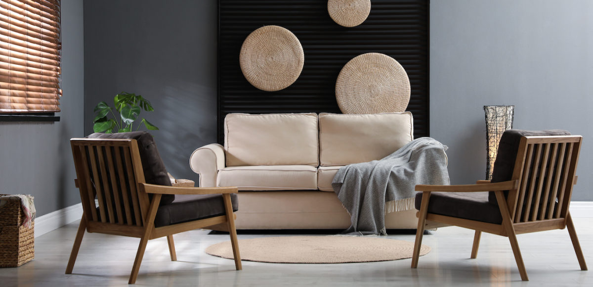
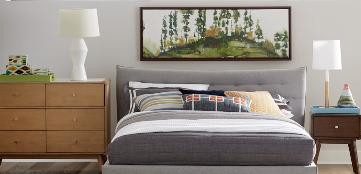
Our brains are hardwired to associate symmetry with beauty — and that’s what makes furniture vignettes so appealing. With your statement piece in place, it’s time to use matching pieces or “sets” to create a visually appealing look. Flank your statement-making piece with a matching set of — well — nearly anything appropriate. In the bedroom, you can use matching nightstands. In the living room, consider a matching set of armchairs. For the dining room, add in two large potted plants on either side of your credenza. The opportunities are endless, and there’s always room for creativity.
Varying Heights
It may seem confusing and counterintuitive at first: how do you incorporate both symmetry and height variance? Simply put, you’ll just need to ensure that you’re also playing with vertical lines in your space when choosing vignette furniture. It may mean using a statement piece that has more height than your other flanking pieces — or the inverse. Height variance can also be incorporated through lamps, rugs, or larger decor items. At the end of the day, your eye is your best judgment when creating a furniture vignette.
Consider Flow and Utility
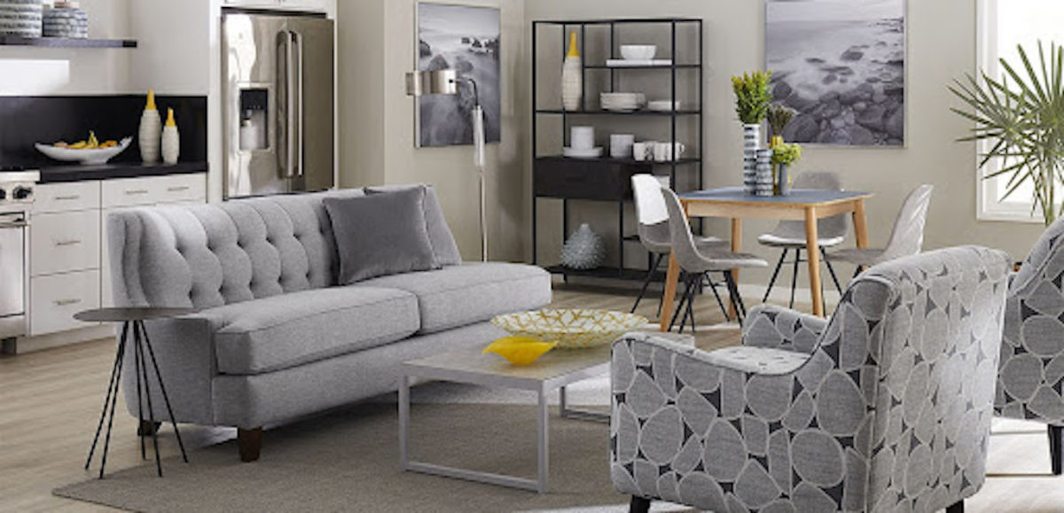
Finally, it’s crucial that you not only think about how your furniture vignettes look but also how they meet your day-to-day needs. While a furniture vignette does add decorative flair, it also must be practical and comfortable enough for you to use. Be mindful of leaving enough space between seating areas or walkways to allow for easy access. Dividing a living room into two seating areas, for example, is an excellent way to create practical furniture vignettes while allowing for optimal use of space.
6 Vignette Decorating Ideas
Just like furniture vignettes, a decor vignette is a tight grouping of decorative items that incorporates the perfect mixture of variance and symmetry. The end result, when well-executed, is to draw the eye in and fill the space without overwhelming the senses.
Whether you’re decorating the top of your bookshelf or creating a tablescape, use these vignette decorating ideas and tips and you’ll be well on your way to creating decor vignettes within your home.
Mix Up Texture and Shape
Visual interest is a key component of successfully designing a decor vignette. Incorporating a variety of textures is an easy way to add spice — whether you prefer a monochrome or colorful and Maxmilast look.
Consider mixing and matching textures. For example, you may want to mix and match glossy and matte elements, brushed metal with shiny glass, polished metal and embossed wax candles, or woven baskets with stained woods. The options are limitless!
From there, consider the shape of the items themselves. Intermex organic lines with sharp, distinct lines to create a visually interesting display.
Add Pops of Color
Color is back and better than ever. What better way to experiment with color than in your decor vignettes? Use color theory basics (and take note of your existing furniture and decor) to create a balance of color within your furniture vignette.
Need some ideas? Look at your “main” decor items and from there create a palette using:
- A monochrome approach: stick to the same hue but vary the tonal depth and intensity
- A complementary approach: choose decor items that are in the complimentary family of your most prominent decor hue
- A colorful approach: Play with every color of the rainbow. Be careful about how and where you place decor items to create better balance and avoid a chaotic look.
Use Odd Numbered Groupings
Three is a magic number — but in decor vignette design, any odd-numbered grouping of items will do! While symmetry and visual weight are key components when creating decor vignettes, there is something that pleasantly throws off our eyes (and brains) about odd-numbered grouping. If you have many like items — such as decorative candles or books — try playing with odd-numbered groupings. The result will be eye-catching!
Vary Decor Height
In order to create visual weight and make the most of your decor displays, you’ll need to vary the height of your decorative items. For example, pairing up tea candles with larger, more imposing items such as a large vase can help draw the eye both down and out. When playing with multiple decorative items, consider staging larger items in the background and allow smaller items to shine in the foreground. Need to add a pop of instant height? Faux plants may act as a quick fix.
Incorporate Light
No decor display, including a decor vignette, can properly shine without the right lighting elements. Give your vignette the display it deserves by positioning it within areas that receive natural light or adding in lamps. Adding in light will ensure that your vignette has proper visual depth.
Everything Has Its Place
A decor vignette isn’t a haphazard assembly of items. In fact, in your furniture vignette each and every item must be placed with care and thought to ensure that it’s adding (rather than detracting) from the overarching display. Determine whether you’d like the bulk of height to remain in the center of your display or at either end and ensure that each item has its own “box” of space so that things don’t look overcrowded.
Find What You Need to Create Vignettes at CORT Furniture Outlet
Ready to tap into your inner interior designer by experimenting with furniture and decor vignettes? We can help you achieve the designer look without the associated designer price tag. Make your statement with furniture and decor from CORT Furniture Outlet. Shop our selection of wall art, faux plants, seating, shelving, and more online or in-store today and enjoy up to 70% off original pricing.


